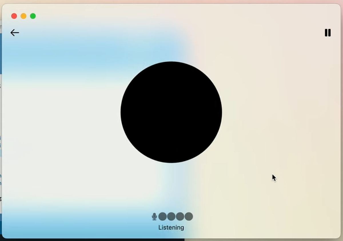
OpenAI just announced a few updates to its flagship conversational AI model, ChatGPT, and among them is a new app and interface, starring the system’s new user-facing personality: a giant black dot.
Onstage at the OpenAI Spring Event, CTO Mira Murati alluded to the changes: “We know that these models get more and more complex, but we want the experience of interaction to actually become more natural, easy, and for you not to focus on the UI at all.”
To that end, the new interface is a dot, or hole, or circle — however you choose to perceive it.
In one sense it is a positive and decisive change, a nod to the minimalism Apple once embraced. And although the bubbly, saccharine voice is another troubling step toward pseudanthropy, at least there isn’t an uncanny face to go with it.
The black dot changes into a stylized waveform when ChatGPT is speaking, just as the prompt area turns into one when the user speaks. It subtly reinforces the idea of conversation and collaboration, disguising the machinery within. Wisely, they chose not to have the dot turn into a giant eye that watches you when you are using its video analysis capabilities. Instead, it shows a live view of what it “sees.”
In another sense, you are probably not alone in what that circle in a rectangle reminds you of:

Obviously OpenAI is not the first by a long shot to embrace this motif in AI. Apple’s Siri has long been round, as is Meta’s eponymous AI. So let’s not read too far into it. (For the record, Google picked a sparkle for Gemini and Anthropic’s Claude remains disembodied.)
But the stark geometric aesthetic has been taken to an extreme here, a combination of shapes that, like it or not, will always be associated with Stanley Kubrick and Arthur C. Clarke’s presciently overbearing AI. (When ChatGPT can read lips, then we will know we’re in for it.)
One could also think of the dot like a block hole for media and knowledge: all the world’s imagery and text compressed into a super-dense ball from which no information about its training data can escape (except in court filings).
Jokes and over-analyzing aside, the decision to go monochrome was probably a smart one, considering the candy-colored alternatives that seem to want to dazzle and comfort you. A black dot is neutral and versatile — adding new capabilities and iconography to indicate its activity is simple, and it’s easily recognizable. Apart from the inescapably sinister connotation of a gaping black maw, it’s a good brand move.
You’ll see the new dot interface in the desktop and mobile apps soon, though the web interface doesn’t appear to use it just yet.
We’re launching an AI newsletter! Sign up here to start receiving it in your inboxes on June 5.


